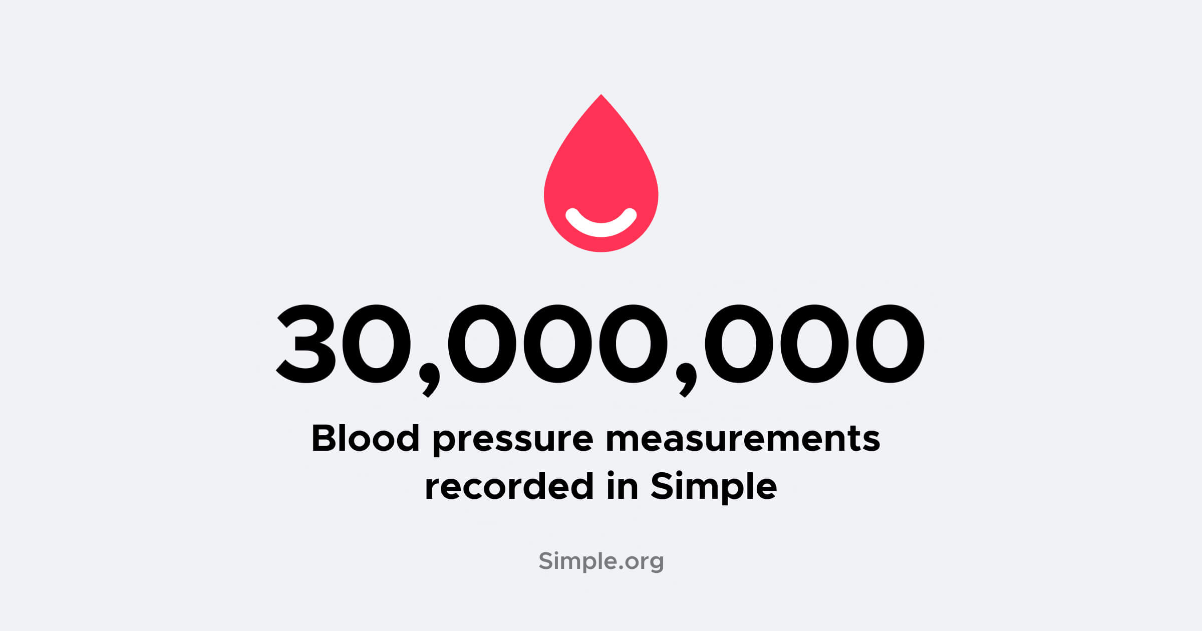

As of a few days ago, healthcare workers had entered 30 million blood pressure measurements for patients. That means that about 30 million times a patient came to a hospital, had their BP measurement taken, and a user entered it into the Simple Android app. It’s a big milestone.
But, what's so special about a blood pressure measure?
This simple piece of data is a key part of hypertension programs, and when utilized effectively can help to save millions of lives each year. Data empowers clinicians to treat patients more effectively, control blood pressure, and ultimately save lives.
However, there is more than meets the eye. Learn how a simple blood pressure measure can be utilized to reveal powerful insights for an entire hypertension program and even benefit a variety of teams in unexpected ways — all it takes is a little creativity.
Battling hypertension at scale
Simple was launched 6 years ago — in that time the Simple app has recorded over 30 million blood pressure readings, which equates to 1 entry every 6 seconds.
Below, is a chart showing the cumulative number of blood pressures recorded in Simple over the last 6 years:
Today, Simple app users are recording more than 1 million blood pressures into the Simple app every month, which is a lot of patient check-ups. This equates to 1 blood pressure recorded every 2.5 seconds!
In our modern, digital world, it's common to hear numbers in the millions and it is easy to become numb to the real scale of that figure.
In the time it takes you to read this article, healthcare workers took and recorded 200 blood pressures into the Simple app. To give a perspective to that figure, tap your finger on your worktop 200 times: it’s a lot!
Now try to imagine 1 million people walking down a large road towards thousands of nurses who are taking blood pressure measures. Each patient sits down and has their BP taken and a nurse records the reading into the Simple app. Once a patient has their blood pressure measured they join the back of the queue, to return again next month to have their BP measured again.

1 million patients complete this loop every month.
That's an incredible feat!
Blood pressure measures: More than meets the eye
A blood pressure reading is a simple piece of data consisting of 2 numbers, a systolic and a diastolic pressure. Using these numbers it is possible to check if a patient has controlled blood pressure. But a little more data is hiding in Simple too.

What is amazing is that utilising these hidden elements can enable us to create huge amounts of helpful data for a wide range of purposes.
Thinking outside the box can turn a simple piece of data into a Swiss army knife.
Patient-level care
From a patient-level perspective, nurses and doctors using the Simple app can check current and historic blood pressure measures for patients during their appointments and prescribe anti-hypertensive medication to help bring their blood pressure under control.
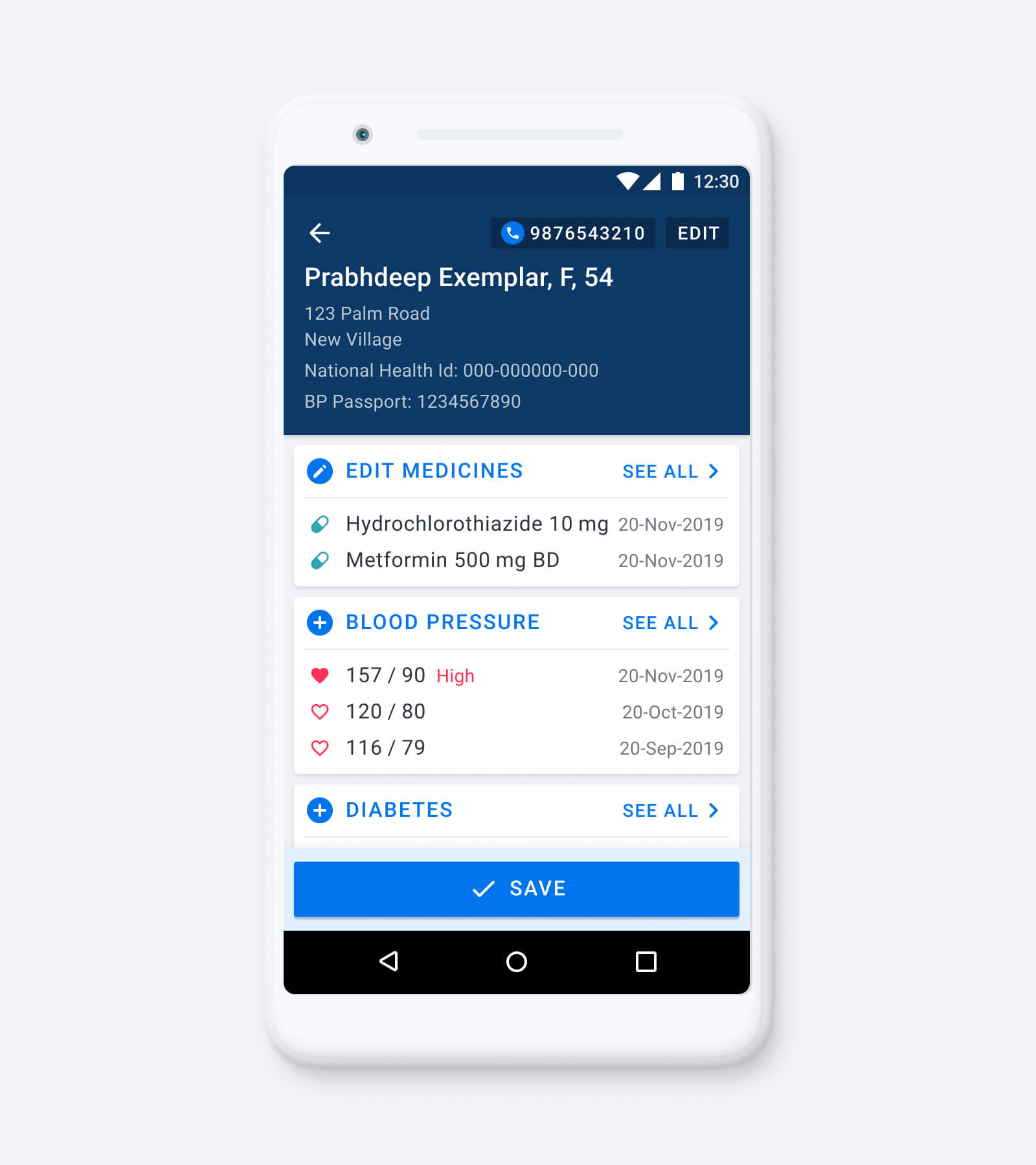
Here’s where things begin to get interesting: By analysing the date of a patient's most recent blood pressure it's possible to see when a patient has missed their scheduled appointment and mark them as overdue.
Managing overdue patients is a big healthcare challenge. Patients not attending their regular follow-up visits will have uncontrolled blood pressure, which increases the risk of adverse events.
The ability to mark patients as overdue enables us to create a working list of overdue patients. This overdue list is built into the Simple app, empowering nurses to quickly identify and call overdue patients to encourage them to attend for a follow-up.

This feature helps add visibility to patients who did not attend their appointments and helps increase the number of patients who return to a hospital for their check-ups.
Hypertension program performance
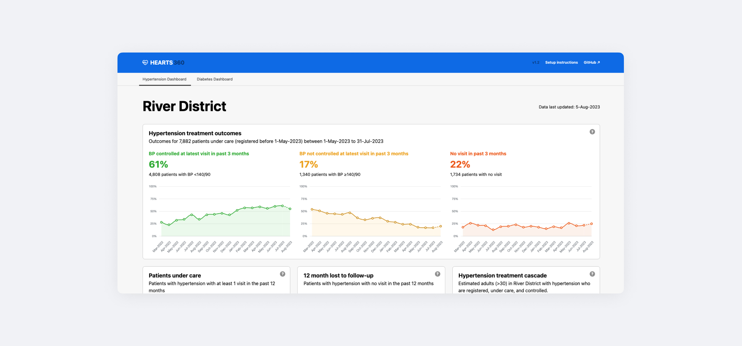
Approaching the data from a different point of view, such as that of an epidemiologist or a program manager, consolidating blood pressure readings of all patients in a hypertension program can provide a broader perspective of program-level performance. This can be used to identify trends in the data across the entire program.
How many patients have controlled blood pressure?
Using the blood pressure reading, the systolic and diastolic figures, the number of patients who have controlled blood pressure in the hypertension program can be calculated.
Additionally, patients with uncontrolled blood pressure at their latest visit can be discovered.
Controlled: Systolic pressure below 140 AND diastolic pressure below 90
Uncontrolled: Systolic pressure 140 or higher OR diastolic pressure 90 or higher
Continuing down this line, by analysing blood pressure data over an 18-month period, this data can be transformed into powerful charts revealing BP control trends to managers and epidemiologists.

These charts form the building blocks of a dashboard showing what is happening in a hypertension program — in near real-time!
How many patients attend follow-up visits?
Patients with a recent blood pressure measure are marked as having attended a healthcare facility. They have attended their regular follow-up.
How many patients have stopped attending for follow-up visits?
Taking an inverse approach we can look at the date of a patient's most recent blood pressure and categorise them accordingly.
In Simple, patients with no blood pressure reading in the last 3 months are marked as 'missed visits' and those with no blood pressure reading in the previous 12 months are marked as ’12 month lost to follow-up’.
These metrics are helpful, informing managers and epidemiologists when patients have stopped attending their regular check-ups. Trending data can reveal broad changes in behaviour, these can be linked to all kinds of things such as seasonal weather patterns making travel difficult, medicine stock outages or stretched healthcare services.

'No visit in past 3 months' and '12 month lost to follow-up' are core metrics in Simple used to help track how well a hypertension program is performing.
How well is the hypertension program performing?
By bringing all these charts together to form a dashboard, it's possible to display a high-level view of the entire hypertension program: How many patients are controlled, how many are attending regularly, how many are overdue for their follow-up visit, and how many patients have stopped visiting.
Program managers and epidemiologists can use this dashboard to; analyse trends, make informed decisions, and see measurable outcomes.

From a humble blood pressure measure to a real-time dashboard revealing meaningful trending data for an entire hypertension program.
Comparing performance
Going one step further, the dashboard can be filtered by region, district or even facility, enabling managers to compare performance.

Providing comparison data empowers knowledge-sharing between high-performing and low-performing regions helping improve patient care.
Care quality improvement
Switching perspective, to a chief medical officer or facility manager, BP measures can even be analysed to improve care quality.
Analysing the blood pressure measures being entered into the system can reveal patterns.
One assumption commonly made is that all the data entering the system will be perfect, correct and follow guidelines — I can assure you it’s not! In fact, imperfect data can sometimes be an advantage.
BP rounding
Analysing systolic value of blood pressure measures yielded an unexpected discovery, some users were rounding the blood pressure readings. This presents a problem, it lowers the quality of data available to analyse and can impact the metrics being reported.
It can also impact patient care as patients may have an inaccurate BP reading on their records which can affect medical decisions being made.

Medicines titration
Taking blood pressure measures and combining them with other data also can reveal new insights.
For example, combining blood pressure measures and prescribed medication data can reveal if patients with high blood pressure have their medication increased during an appointment.
This shows if patient medication is being titrated promptly, helping to ensure patients are prescribed suitable anti-hypertensive medication.
Action through data
Revealing this data helps identify shortfalls in care enabling quality improvement teams to explore the cause of those shortfalls and take informed action to improve patient care.
This is often actioned through education materials and training.
Software quality
Changing perspective a final time, to software development teams, BP measures can help provide insight as to the usability of the software.
The Simple app is being used by nurses working in incredibly busy healthcare hospitals. It’s common for nurses to deal with up to 200 patients during a busy workday.
Examining the time at which blood pressure measures are recorded reveals if busy healthcare staff are using the Simple app to record data during busy clinics.
A major problem with software design is ensuring it fits into busy workflows, especially in stretched healthcare teams. If teams are unable to use the Simple app during busy clinic hours the data will show BP records being created in bulk at the end of a working day.
This data is valuable and helps inform the Simple design and engineering team of potential barriers to data entry and ultimately shortcomings in the design of workflows or engineering of the app.
Data not entered into a system is invisible—it’s hard to track and ultimately reduces trust in the software system as a whole. It’s easy for things to get forgotten, notes to be missed or records mixed up when done at a later time. For this reason, it’s vital the Simple app is used during busy clinics to avoid data loss.
While software quality is not an exact science in this case, it helps form part of a wider set of information we can use to improve the Simple app.
Conclusion
- Data doesn't have to be complex to have a big impact A single piece of data is all you need to build highly impactful metrics. Using blood pressure measures Simple can inform patient-level care, program-level performance in real-time, quality care improvement and even software usability.
- Using data creatively can reveal powerful insights Utilizing less obvious elements of a piece of data such as; the time or date it was created, consolidating historical data, and analysing patterns within the data can generate enormous amounts of useful information and help improve patient care.
- Data can be used to inform a diverse range of teams A single piece of data can be used to help different users, from nurses working in healthcare facilities to hypertension program managers — even software design teams.
- Trends data is powerful Teams across a range of disciplines can make informed interventions and see measurable results, revealing if the interventions had the desired effect.
All this from a single blood pressure—amazing really!