Great health tools can’t be created by smart designers from their office in Bangalore or New York. Great software is made by working with your users directly in the field, observing their workflows, listening to their needs, and co-creating solutions together.
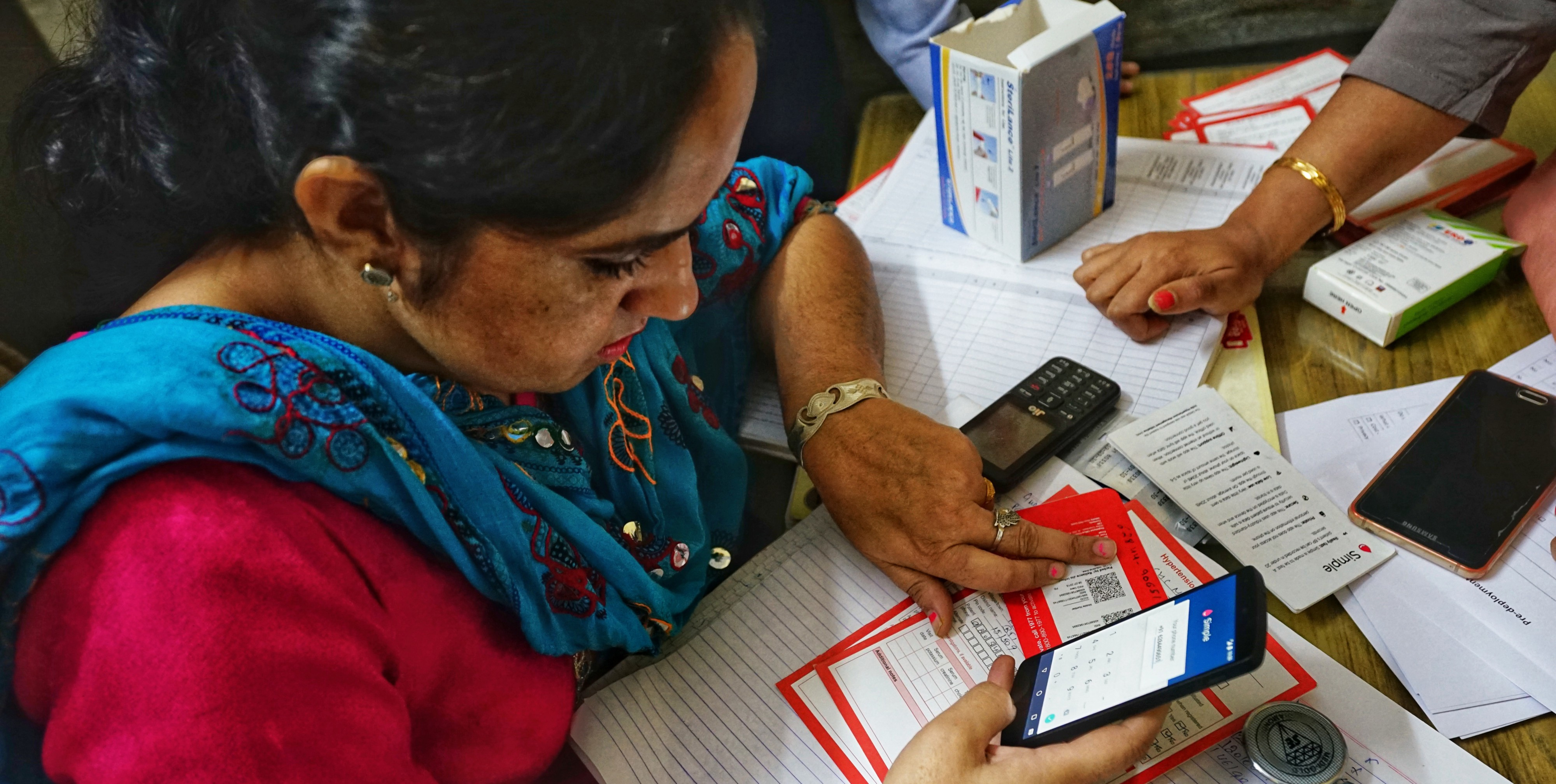
Our team frequently visits rural health facilities across India where the Simple app is being used to manage patients with hypertension. In the field, we observe and listen to our users directly. Recently, we took our testing a step further by co-creating solutions with some of our advanced users who have been using Simple for about a year.
Co-creation is a relatively common participatory design technique which is centered around the voice of the user and includes them during the design process. Instead of just showing already-baked designs to users, we bring raw ingredients to the table and create a solution together.
Our team are technologists, designers, and doctors who care about our users. On our own, we’re just a bunch of geeks and public health people slinging pixels and lines of code. Together with our users, we are a super team that understands the challenges on the ground and the public health objective and the underlying challenges in the technology solutions.
Set the challenge
The Simple app has a section called “Progress” where users can track how many blood pressures are recorded and how many patients have a follow-up visit every month. This “Progress” tab is a useful feedback loop for healthcare workers to see if they are managing patients effectively. The challenge was to make the feedback loops more useful to our users and ideally encourage positive actions at work.
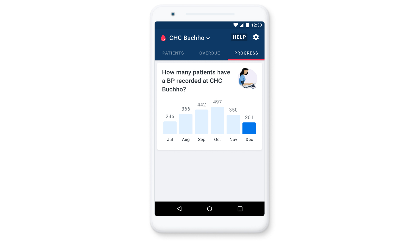
The progress tab shows statistics for a facility, to encourage healthcare workers in their work
Prepare
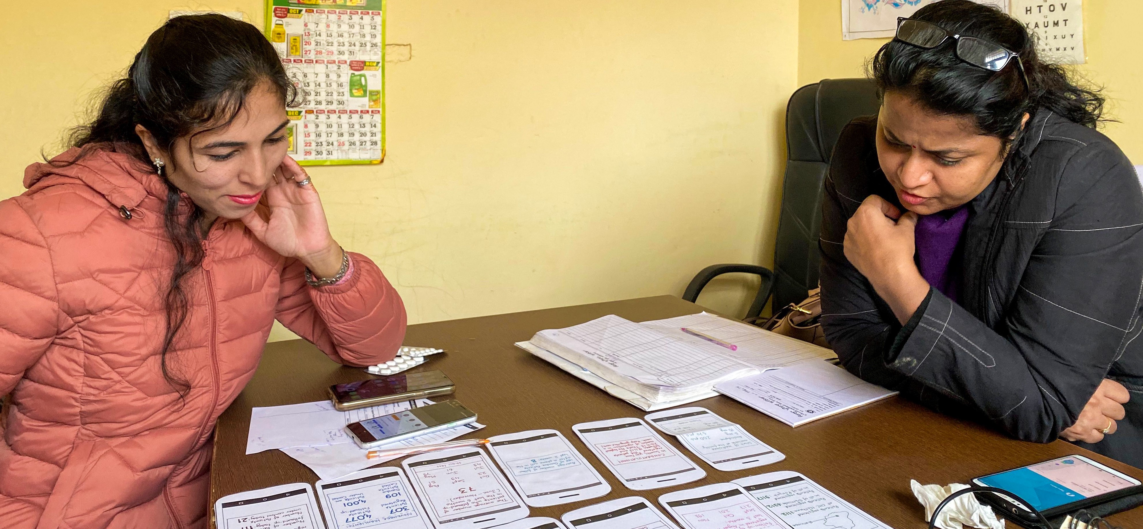
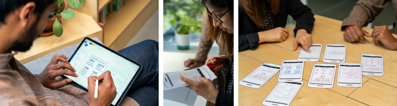
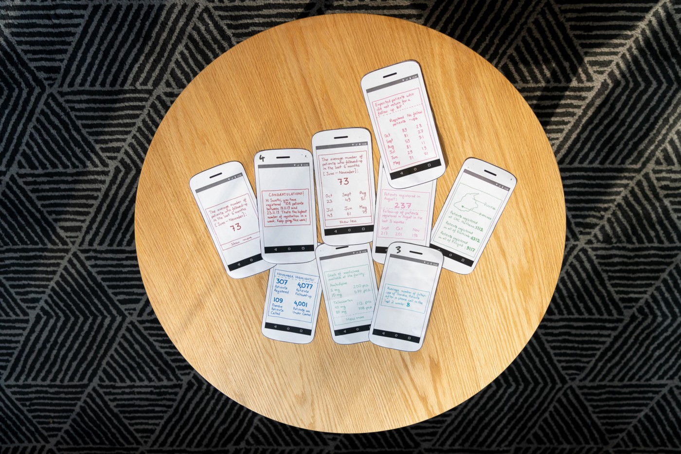
For our co-creation exercise, we wanted to come to the table with some ideas already partly prepared. In our experience, when a co-creation process starts with a completely blank slate, the participants have a hard time getting into the flow. So, a few days before we went to the field, we created some rough concepts to kindle a strong discussion with our users.
We started our prep day by aligning on our goals, sketching ideas individually (something like crazy 8’s), and voting on them. The most voted ideas were taken forward and we cannibalized a few concepts from the less voted ideas.
Set the stage
Our users (nurses, pharmacists, and doctors) are always busy attending to long queues of patients. So, we waited for a 15-minute window of free time, and then laid out all of our design ideas in front of each user. For instance, we would ask a nurse to pick the ideas that she found most interesting and have her explain to us why she liked them. All the users looked at the ideas one by one and understood most of them. (We were glad we kept the designs simple!)
To make the process more interactive, we asked each user to pick their 3 favourite ideas and explain their choices to us. These explanations were key to the whole co-creation process:
I absolutely need this (an idea), no one appreciates our hard work, this is so motivating,’’ “Oh! stock of medicines? how will you get this?
I’ll chose this because this idea is a mix of all other 3 ideas
Oh! Can you really show me daily updates? This will be super helpful in cross checking if everything is updated
I don’t want to see state level info, its of no use to me, maybe you could instead…
Solicit new ideas
As they shared their feedback on the pre-baked, existing ideas, we encouraged our users to suggest their own new ideas. They suggested:
Could we see a list of patients who missed a follow-up visit?
Can we compare our performance with teams like ours at similar size hospitals?
Can we add a list of patients who we called but who never came for a follow-up?
Can we have a task list of things for me to finish before the end of the day?
Opening up a discussion with our existing concepts not only gave us useful qualitative feedback about those specific ideas, but the follow-on discussion helped us understand what else we could do to help our users track the progress of their work. Their original ideas were incredibly valuable and will now make their way into the product.
What we learned about this process
Lesson 1: Just the right amount of fidelity
Using paper prototypes helped us to focus the users’ attention on the parts that really mattered — the content, not the design. The low fidelity prototypes also set the bar low, so nurses felt comfortable criticising the ideas and also gave them confidence to present their own ideas even if they couldn’t draw well.
Lesson 2: Choices are empowering
Nurses and doctors felt involved in the decision making process behind an app that they use every day. They expressed that they felt safe and motivated to express their thoughts. Also, because they could choose from many ideas, there was no pressure to be right or wrong.
Lesson 3: Get your users to be creative
When your users are busy with daily responsibilities and repetitive tasks, it is hard to suddenly switch context and start thinking creatively. This paper-based activity lowered the bar and allowed nurses and doctors to imagine scenarios “out of the device.” Pen and paper, and the inspiration of seeing our ideas in front of them, effectively shifted their mindset to creatively suggest ways our software could make their work life better.
This is the first time we tried this method of co-creating with our users and to be honest, we were a little skeptical in the beginning. Would we be able to find the time with our busy users? Would our users engage with us creatively? Co-creation was a super useful technique. We got great suggestions, our users felt happy and connected to the product development. This process will now be a frequently used part of our toolkit.
Thanks
Thanks to Varenya Raj, Akshay Verma, Tanushree Jindal, and Daniel Burka who worked on this project. And, most of all, sincere thanks to our users who not only managed to take out time for us during their busy working hours, but also help us create solutions that make Simple better for their colleagues around the world.
My role
I am a product designer at Obvious.in, in Bangalore, where I lead our design work on the Simple project. We work with Resolve to Save Lives and their partners in IHCI (the India Hypertension Control Initiative). I strive to retain the simplicity of ‘Simple’ to ensure health care professionals (who are doing the really hard work of saving lives) find the software to be easy, intuitive, and obvious to use.