
Manjeet was counseling a patient with high blood pressure when another patient jostled through the crowd and asked her to hurry up. Each patient was impatient to get back to their own busy lives. Everyone in the hospital today was rushed, just like every day at many overworked public hospitals in India and around the world.
Our team works on a piece of software called Simple, which is designed for nurses like Manjeet. Busy nurses with many patients. They use Simple to manage patients with high blood pressure, with the goal of saving many lives from heart attacks and strokes.
Keep in mind, clinicians don’t especially want to invest their time in an electronic medical record. Nurses and doctors didn’t come into work today to fill a database. They came to do the important work of treating the patient sitting in front of them. If we want Nurse Manjeet to use our software, we must understand the working lives of nurses like her and fit into them as seamlessly as possible.
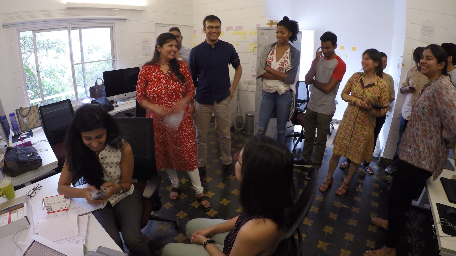
So, our team spends a lot of time in the field observing healthcare workers and asking for their help.
When we talk to healthcare workers about their workflows and how they use Simple, we are looking for patterns. Hearing a concern once is useful; hearing a pattern of concerns is really helpful. How can we effectively communicate these patterns to the entire product team so we can make better product decisions together?
Our challenge was to bring lessons from the field into our office, so our developers, designers, and product managers can empathize with nurses and prioritize our roadmap. Inspired by Airbnb’s ‘Snow White’ project, Simple’s Design Director Daniel Burka suggested a visual, data-driven storyboard that illustrates the key parts of the user journey. The storyboard is now a crucial component in our product process.
How to create a data-driven storyboard
1. Choose your protagonist and her story
The first step would be to choose the primary user whose story you are narrating.
Simple is used by many types of users: nurses, doctors, pharmacists, counselors, and other healthcare workers.
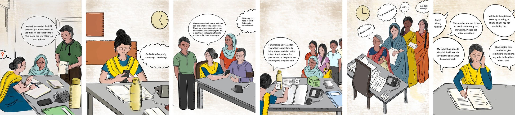
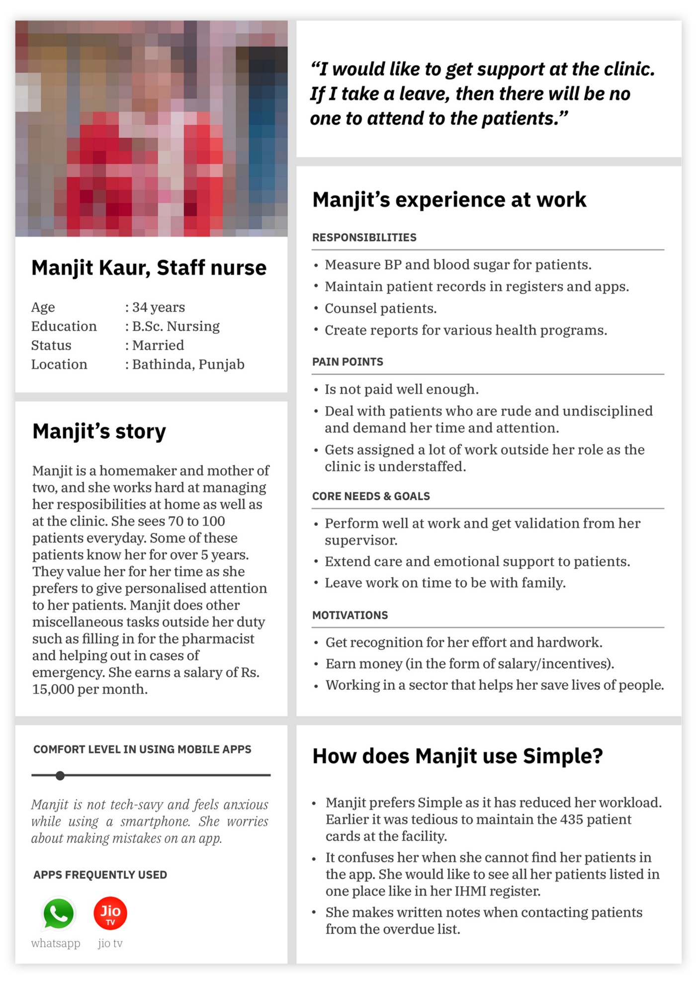
We chose to tell the story of Manjeet, a fictional staff nurse working at a public health clinic who is new to using software and apps. We chose her because she represents the largest group of our users and the most crucial users for us to satisfy.
The narrative is an end-to-end story of how Manjeet hears about Simple for the first time, her thoughts as she learns to use the app in her workflow, and how she ultimately teaches a colleague to use Simple. Keep in mind that your story isn’t only about how someone uses your software — it also encompasses your user’s overall workflow.
2. Identify the key moments in the user's experience
Select the key moments that describe your primary user’s interaction with your product in her context. We created a list of all the different user scenarios, and then grouped them, categorized them and prioritised them.
Prioritise the moments that occur most commonly and emphasize aspects of the user’s experience that need the most focus from the product team.
For scenarios where multiple workflows existed, we focussed on what either needed the most support or was most common. For example, there are multiple ways in which a nurse can hear about Simple. It could be through a memo, during a training session, or from another nurse. In our final storyboard, we picked the scenario where a nurse is instructed to use Simple through a memo. This scenario is especially challenging: How can a nurse learn to use the app by herself, without any prior training from her supervisors?
Warning: Avoid focusing only on the digital interactions between a user and your product. Remember to also include offline experiences that glue together your product in the story.
For example, we chose scenarios that depicted both online experiences like onboarding, registering a new patient, and making overdue calls, as well as offline experiences like patient treatment, being called out of the room for an emergency, and juggling several tasks at once. Offline and online experiences make up a nurse’s day and if our product falls apart when our users lose focus, our product will be useless.
Finally, we ordered the key moments so each frame independently captures that moment but also so when they’re stitched together they tell a meaningful story.
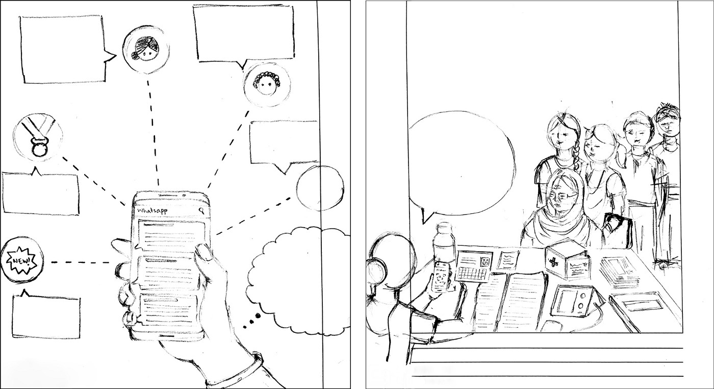
3. Sketch the key moments
As you sketch each moment, keep the user’s experience, front and center:
Refrain from giving the product more importance than the user. And, focus on capturing the essence of the moment, without limiting yourself to what seems possible to solve.
Stay close and truthful to the research data. For each frame, we pulled out the findings that we developed from user research. We depicted the details of her environment: ‘What does her table look like?’, ‘How does she interact with her tools?’, etc.
We made rough but realistic pencil sketches of the eleven key moments.
We wanted to stay close to the user’s actual experience: ‘How many patients will a nurse be attending at a time?’ ‘What are the tools a nurse uses for his/her work?’ ‘How old are the patients who visit the clinic?’ ‘What do patients carry along with them?’ ‘What is the conversation between the nurse and the patient?’ ‘What time of the day would it be when a particular moment took place?’ ‘What are the character’s thoughts?’ ‘What does the nurse’s environment look like?’ ‘What perspective must a frame be depicted in?’
4. Focus on your users' concerns
Below each scenario, list down your users’s concerns. This puts readers into the user’s context and enables product teams to set clear goals. Remember to only add concerns from research data, and refrain from adding concerns that you anticipate the users might have.
Each frame of our storyboard has a list of the most common concerns that we have heard from users and stakeholders in the field.
While many concerns can be tackled through the design of the product, others form touchpoints within a service that product teams must strive to design for.
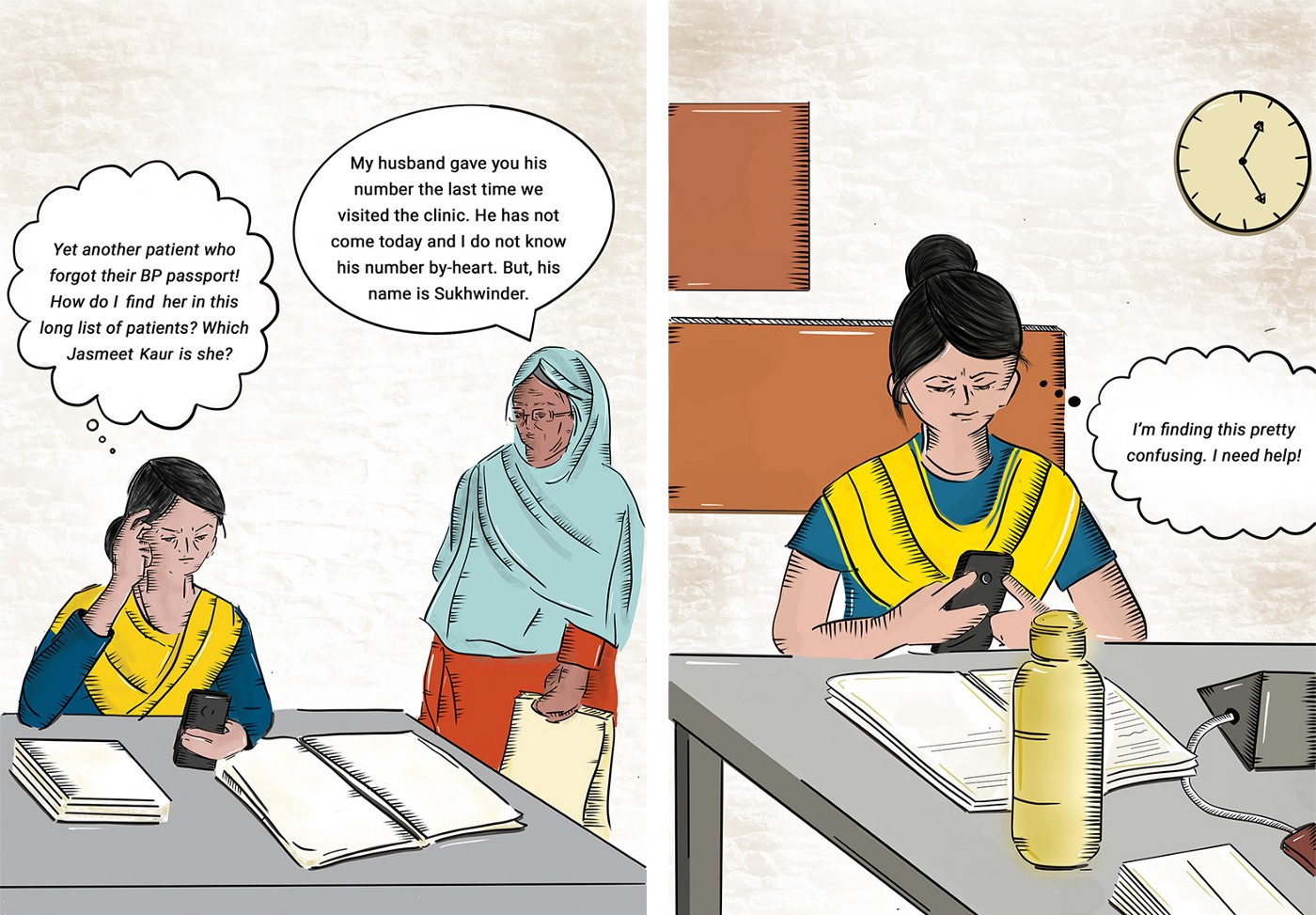
5. Create the final illustrations
After having consensus from the team on the depiction of the frames, we then made the final illustrations.
We made the colour and style of the protagonist’s clothing bright, so that she stood out in each frame.
We also kept the style of the illustrations relatively simple. If your illustrations are too fancy, you will have a hard time changing them later when you find out that a detail is wrong or you want to add another frame to your story.
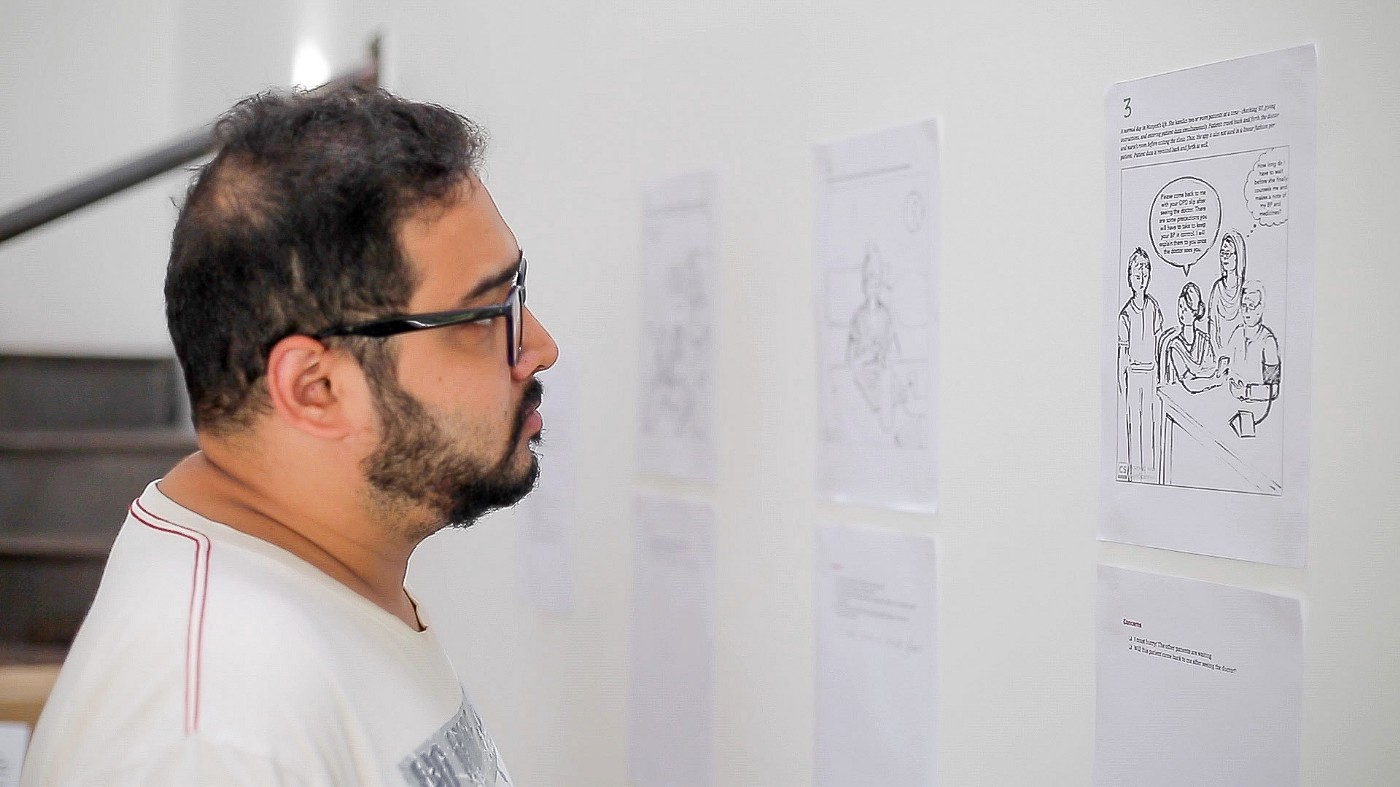
6. Publish the storyboard where everyone can refer to it
It’s really important to publish the storyboard in a place where everyone on your team can reference it while they work. Ideally, the storyboard is easy to edit as you learn more from the field and as your product changes.
We published our storyboard on our documentation site (we use GitBook). And, we also printed out each frame and hung them prominently on our walls in our workspace.
How did the storyboard help us?
Each time we make design decisions, we can go back to the pain points and try and address them through the design of our service. Our product must address as many of these concerns as possible if we hope to help thousands of clinicians to save millions of lives. It also helps to remind us that software isn’t the only solution required — we also need great training, support, and marketing.
For engineers and others who aren’t frequently in the field, the storyboard has really helped to build more empathy with our users and gives them context when they’re making decisions.
“Since I’m new to this project that has been running for a year now, the illustrations were helpful in immediately putting me into context.”
- Ragunath, Android Engineer, Simple
The eleven frames of our storyboard are a reminder of what we’re really building and how it affects our users. Moving forward, we aim for the storyboard to be a tool that fosters the participation of all stakeholders in the product design process, helping us all to make good decisions.
Thanks
This article is co-written with Tanushree Jindal, without whose valuable input creating the storyboard would not have been possible. Thanks to Daniel Burka for his help in writing and editing, which helped us strengthen the article.
Special thanks to Dr. Terry Cullen and Dr. Greg Schmidt for reviewing and editing the article, and to Anand Ramakrishnan for the photography.