In July, the team behind Simple put out a call for contributions to the brand for this open source project. Simple is an app for healthcare workers to track patients with high blood pressure.
The contributions from the community have been nothing short of stellar. Whoa! We are so happy with where this project landed. Thank you so much to every single person who contributed with their design work, critique, and encouragement.
The most exciting part of this process has been the collaboration. A bunch of strangers on the internet threw ideas into the pool and then built on each other’s ideas to create something really tremendous.
No one can take exclusive credit for the Simple identity, which is really cool! The final identity was a shared effort through respectful collaboration. 🙌
How the process worked
When the design brief was posted, a large group of designers jumped in to contribute their ideas. Designers went really wide and generated ideas that would serve as inspiration for the next wave of contributions.
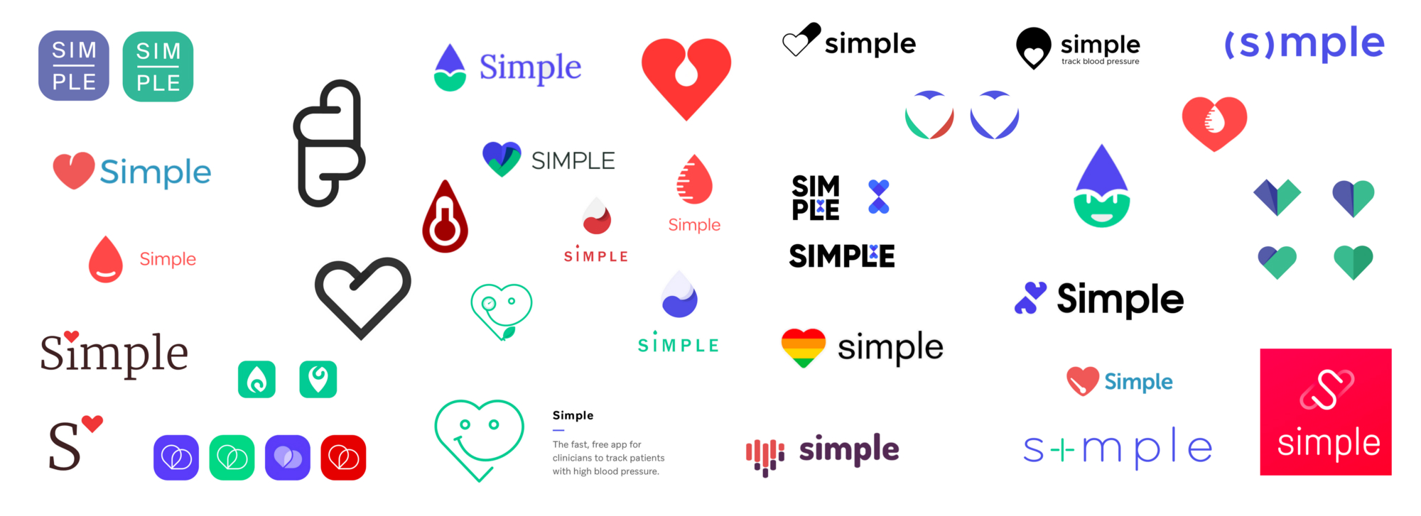
Ideas from Phase One of the design process
Everyone jumped in with questions and critique of ideas that had been submitted. How would we handle other languages? Did heart shapes have different meanings in different cultures? How important was an app icon?
Next, we focused on several of the most promising ideas and started narrowing. We chose these three for phase two:

The ideas selected for further exploration in Phase Two
To be honest, I think we could have spent more time in phase two with a focused effort. The team that was working on the Simple product were in the middle of the first deployment in India and our focus was there.
Color and typography explorations were very useful. We got to try many different combinations, each of which spoke with a unique voice.

A few of the color explorations
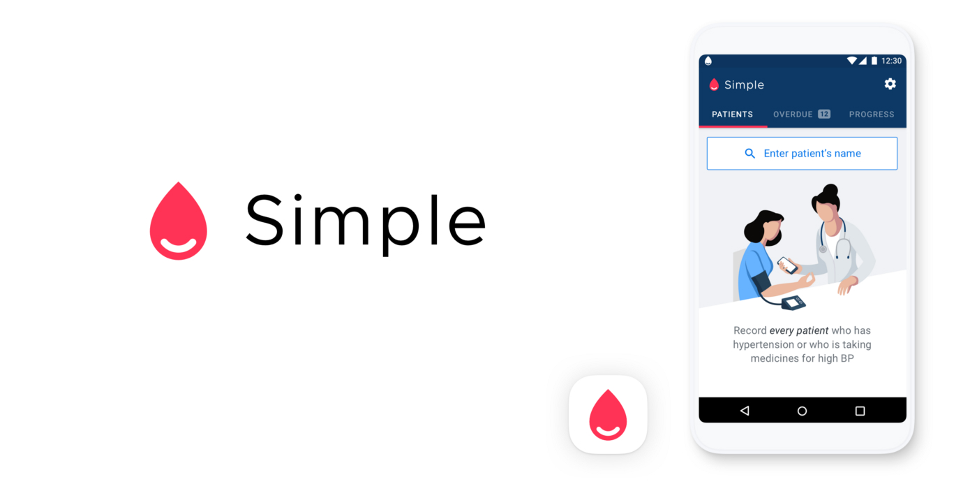
In the end, we settled on the blood drop with a bottom smile/shine. It ticks all of the key attributes that we asked for in the original design brief:
Think of the brand like your favorite nurse: smart, insightful, careful with your privacy, and treats you as a human being. The brand isn’t goofy, corporate, aloof, or complicated.
Most other software that healthcare workers use is complicated and hard to learn. Our aim is to be a breath of fresh air — an app that’s simple, which healthcare workers actually like to use.
The final colors are a nice combination of trustworthy and modern. We particularly dig the hot red/pink color for the blood drop in combination with the serious navy blue (see screenshots of the Android app).
What worked and what could have worked better?
Things that worked well:
- Contributions came from 30 wonderful designers.
- We went really wide with the initial ideas.
- Critique was constructive and supportive.
- Everyone was willing to use a CC0 license to make their willingness to share their ideas explicit.
- People built on ideas from each other! This was our favorite part of the process.
- The end result is better than we could have possibly hoped for.
Things that could have been better:
- Display of “Simple” in other languages could have been decided earlier.
- Our team’s support of Phase Two could have been better. We lost our focus.
- The three ideas for Phase Two could have been explored more deeply.
- More people could have been involved in the creation of a style guide.
What's next for Simple?
We are currently deploying Simple with the India Hypertension Management Initiative group in Punjab and will begin deploying in other states later this year.
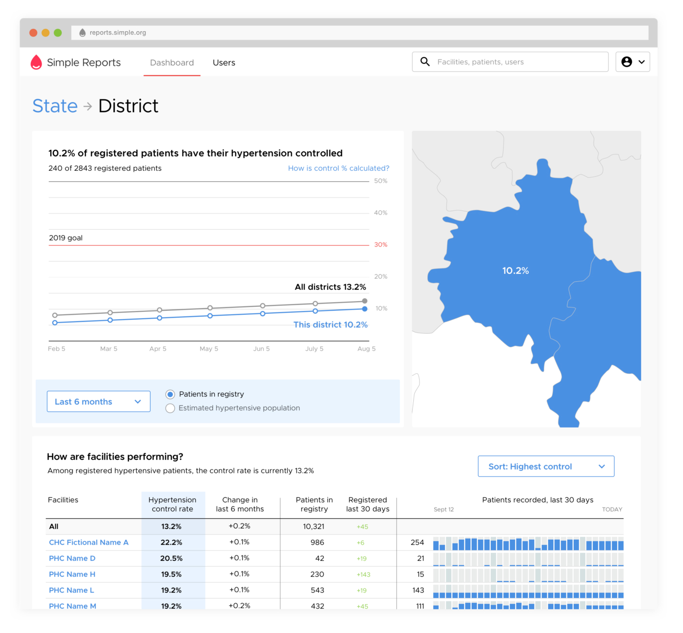
Our group of contributors to the open source project are working on the Android application for healthcare workers and building out a Simple Reports product with dashboards for people who manage clinical care across a region.
And, this is just the beginning… we are constantly learning and iterating and hope to deploy Simple in more places that would find it helpful for increasing hypertension control in their region, to save lives.
Thank you!
A huge thank you to everyone who contributed ideas, gave critique, asked questions, and helped us refine the brand. Specific thanks to:
Dann Petty, Menachem Krinsky, Meg Robichaud, Gabriel Valdivia, Mike Davidson, Juhi Chitra, Dhruv Saxena, Akshay Verma, Michael N ✅, Kelly Jepsen, Thomas Drach, Vincent Le Moign, Michael Ellis, Steven Garrity, Misha Heesakkers, @toferflowers, @uppalled, Sarah Hanna, Bryan Sellers, @jamtrash, Ross Malpass, Sam Baines, Rahul Chakraborty, Milap Bhojak, Jarrid Bainbridge, Lisanne Binhammer, @aentan, Phil Hammel, Crystal C. Yan, @rickymetz.
A few more examples of the identity in projects that are in our pipeline at Simple:
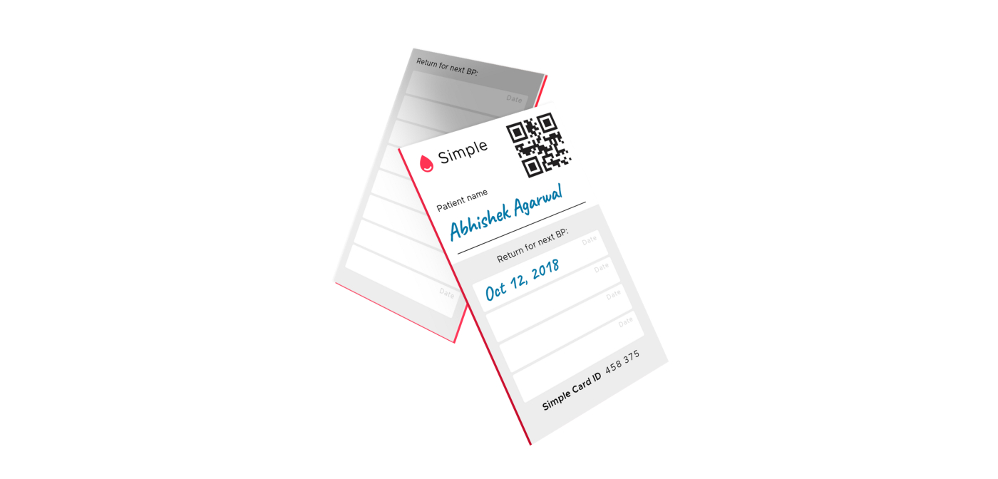
Printed cards for patients
